A Fresh Month, A Fresh Table: Spring Tablescape Ideas in Orange & Pink
Spring has a way of making everything feel possible. The days stretch longer, the light comes in warmer, and suddenly you want your table to match that energy. If you've been looking for spring tablescape ideas that feel fresh and genuinely elevated, not just "throw some flowers down and call it done", this guide is for you.
This season, we're leaning into a bold orange and pink palette. It's energetic without being overwhelming, and when you layer it thoughtfully with texture and a little sparkle, the result is a table that feels both polished and alive. Here's how to build it from the ground up.
HOW TO LAYER A SPRING TABLESCAPE WITH TEXTURE AND SHINE
Every well-styled table starts at the foundation. That means thinking beyond the plate.
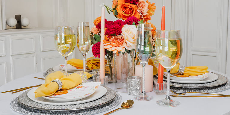
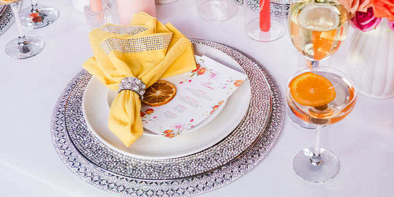
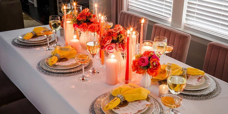
Begin with a placemat that adds structure without competing with your color story. The Madison Avenue Placemat does exactly that. Its refined texture grounds each place setting and gives every layer on top more visual weight. Placemats are often the first thing people skip. In our experience, they're actually what separates a styled table from a set one.
Once your base is in place, layer in a Strass Charger Plate. Charger plates instantly elevate the look by framing your dinnerware beautifully. The subtle crystal detail catches the light in a way that feels luxurious without overdoing it. This is the combination—decorative placemat plus charger—that gives your table that editorial, high-end feel.
THE LAYERING SECRET
The most designer-looking tables use at least three layers per place setting: a base (placemat), a frame (charger), and the actual plate. Each layer adds depth. This is why even simple dinnerware looks elevated when the foundation is right.
BUILDING A BOLD SPRING COLOR PALETTE THAT STAYS POLISHED
Spring doesn't have to mean soft pastels. Bold color works just as well, sometimes better, when it's balanced carefully.
Orange brings warmth and energy. Pink softens it with a romantic, playful touch. Together, they capture the spirit of the season without feeling loud. The key is letting your linens and florals carry the color while keeping your foundational pieces more neutral and polished.
For linens, look for something tailored. A stripe pattern on the Stripe Napkin Set adds visual interest without introducing a third color to manage. Folded neatly or draped loosely, a well-chosen napkin creates movement and warmth that contrast beautifully with the structure of a charger plate.
Finish each setting with a Montaigne Pearl Napkin Ring. The pearl detail is soft and elegant, tying the place setting together with just enough refinement. These small touches are what make a table feel thoughtfully styled rather than assembled.
BOLD COLOR DOS:
- Keep chargers and glassware neutral or metallic
- Let florals carry the brightest tones
- Use linens as your color bridge
- Repeat one color in two places minimum
BOLD COLOR DON'TS:
Avoid introducing more than two accent colors. Too many competing tones make even beautiful pieces look chaotic. When your palette feels busy, pull back to your two hero colors and neutralize everything else.
FRESH FLORAL STYLING TIPS FOR SPRING TABLESCAPES
No spring table feels complete without flowers. But the goal isn't a perfect arrangement—it's movement and softness.
For an orange and pink palette, choose blooms that feel a little undone. Ranunculus, tulips, peonies, and roses in coral, blush, and soft peach all work beautifully. Vary the bloom sizes. Keep arrangements low enough for easy conversation. Let greenery soften the edges rather than structure them.
Fresh flowers do something that no product can fully replicate: they balance the shine of crystal and metallic details with warmth and organic texture. That contrast (sparkle against something natural) is what makes a table feel truly alive.
A few quick floral tips worth keeping in mind:
- Use odd numbers of stems for a more natural look
- Place your tallest blooms off-center
- Echo your table colors in at least two spots in the arrangement
- Trim stems at an angle to extend the life of your flowers
HOW CANDLELIGHT AND GLASSWARE COMPLETE YOUR SPRING TABLE SETTING
Candlelight transforms a table faster than almost anything else. Even in daytime settings, a votive adds warmth and intimacy that makes guests want to linger.
For this orange and pink spring setup, scatter a few Strass Votive Holders down the center of the table or place one at each setting. The crystal detail catches the light beautifully, adding another layer of texture without cluttering the visual.
For glassware, think about mixing styles intentionally. A wine stem and a coupe glass side by side create that curated, collected look that feels designed rather than matched. The Vetrina Stem Coupe Glass is perfect for spring entertaining because it has a playful, celebratory quality that suits the season. Pair it with Vetrina Stem Wine Glass for cocktails, sparkling water, or a toast, and your glassware instantly becomes part of the story.
Mixing glassware styles is one of the simplest designer tricks. It makes your table feel curated, not coordinated.
YOUR SPRING TABLESCAPE CHECKLIST:
- ✨ Layered foundation: placemat + charger plate
- ✨ Bold two-color palette carried through linens and florals
- ✨ Napkin rings for a polished finishing touch
- ✨ Low, organic floral arrangements for softness
- ✨ Votives scattered for warmth and glow
- ✨ Mixed glassware styles for a curated look
The best spring tablescapes don't look perfect—they look inviting. That's really the goal. Balance your color palette with clean layering, add texture where it counts, and let a few statement details do the heavy lifting. When everything works together, your table becomes part of the celebration. This season, that's exactly where it should be.
Comments
Leave a Comment