The Psychology of Color: Creating Emotionally Intelligent Spaces

In interior design, color is more than just a visual element. It's a powerful tool that shapes mood, brings out emotions, and shows personal taste. Whether you're styling a modern living room or refreshing a cozy dining nook, a thoughtful color palette can elevate your space and express your personality in bold, beautiful ways.
THE SECRET TO COLOR'S EMOTIONAL POWER
Research shows that our brains process color information not just visually but emotionally, triggering physical responses ranging from increased heart rate and energy with vibrant reds to lowered blood pressure and calming effects with certain blues. This natural response has deep roots—our ancestors relied on color to identify everything from nutritious foods to environmental dangers. Today, we use this connection to create spaces that not only look beautiful but actually influence how we feel and function within them.
The Science Behind Color Psychology
This understanding transforms color selection from a purely visual choice to a smart design decision with real effects on wellbeing.
Setting the Tone: Creating Emotional Foundations
Color serves as the foundation for setting the overall mood of a room. Warm tones like terracotta, burnt orange, and golden yellow give off comfort and energy. They're perfect for social spaces like glam dining rooms and living rooms. On the other hand, cooler tones like sage green, navy, and soft gray create calm and focus. These are ideal for bedrooms or home offices. Understanding color psychology helps you create the mood of each space with purpose.
COLOR TEMPERATURE PRINCIPLES:
- Warm-toned rooms invite lingering and conversation—they create environments where people naturally gather and connect
- Cooler palettes create mental distance and clarity—perfect for spaces where focus and concentration are priorities
- Spaces used primarily in the morning benefit from energizing colors that align with natural body rhythms
- Evening-use rooms call for soothing tones that signal relaxation and prepare the body for rest
Expressing Personal Style: Your Color Signature
Your home is your canvas, and color is the palette that brings your vision to life. Whether you're drawn to vibrant jewel tones, single-color modernism, or pastel pops, your color choices tell a story. The most compelling interiors often mirror their owners' personalities through color choices. Thoughtful individuals might lean toward deeper, more complex hues with multiple undertones. These colors reveal different aspects in changing light and reward close attention.
Adding bursts of bright color or layering rich textures can elevate your home decor with personality and style. Try velvet, crystal accents, or metallic finishes. Crystal elements like the Strass Votive Holder offer an elegant way to add reflective surfaces that interact with colored light throughout your space. As light passes through its hand-applied glass rhinestones, it creates subtle color play that adds depth without committing to a single hue. This is perfect for those exploring color relationships before making bolder choices.
Color confidence develops over time. Don't feel pressured to immediately embrace bold choices if they feel overwhelming. Start by adding color through accessories that can be easily changed. When selecting accent pieces, look for items that can work with different color schemes as your preferences change. This approach allows for experimenting while building a collection of versatile design elements that will serve you through multiple versions of your space.
Creating Visual Interest: Composition and Contrast
Smart use of color adds visual interest and depth to any space. Understanding basic color theory principles like complementary and similar relationships allows you to create sophisticated palettes with professional results. Complementary colors are those opposite each other on the color wheel like blue and orange or purple and yellow. They create maximum contrast and visual energy. Similar colors create harmonious, soothing arrangements with subtle variation.
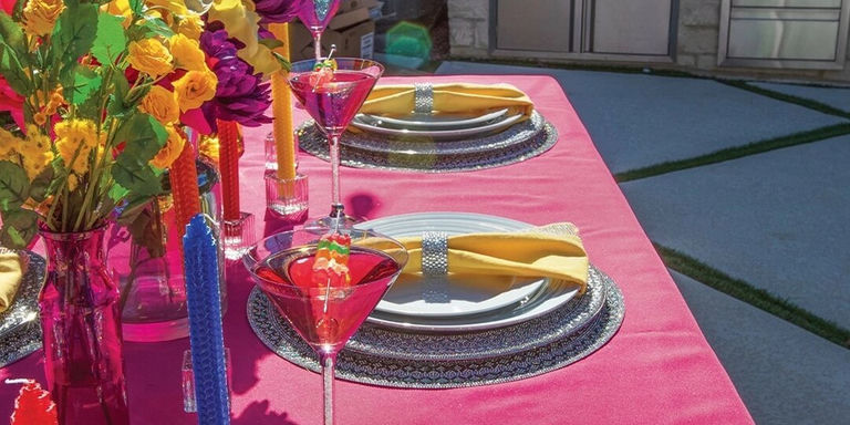
Bold accent walls, glam accessories, or color-blocked furniture can transform a room from simple to stunning. Play with contrast and texture to add depth—think hot pink paired with gold, or rhinestone chargers on a black velvet tablecloth for maximum impact.
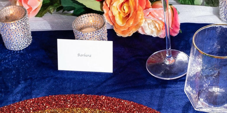
The Madison Avenue Placemat shows this principle beautifully. Its thousands of glass rhinestones create visual interest through varied light reflection against deeper-toned tablescapes. This adds dimensional complexity that engages the eye while providing a neutral foundation that enhances both bold and subtle color stories.
When planning color placement, think about visual weight. Darker colors appear heavier while lighter tones recede. This principle can be used strategically to create balance in uneven rooms or to highlight architectural features. The interplay between solid colors and reflective elements creates particular visual richness, especially when light conditions change throughout the day.
Influencing Mood and Productivity: Functional Color Selection
Color directly impacts how we feel and function. Blues and greens promote focus and calm. They're ideal for serene bedroom decor or productive workspaces. Bright tones like citrus yellow or coral pink can energize a kitchen or studio. Whether you're aiming to boost productivity or enhance relaxation, using color intentionally ensures your home supports your lifestyle.
The smart use of color can completely transform how we use our spaces. In home offices, studies show that exposure to blue light wavelengths improves alertness and brain function. Adding this color in work areas can enhance focus during important tasks. Meanwhile, restful greens with balanced undertones reduce eye strain during long computer sessions while promoting overall wellbeing.
Think about adding color not just on walls but in functional accessories that support your daily activities. Writing tools, organizational items, and even technology accessories in thoughtfully selected colors can enhance the emotional experience of routine tasks. This complete approach ensures that color supports your lifestyle at every touchpoint.
Playing with Scale and Proportion: Spatial Color Dynamics
Smart color placement can reshape a space. Lighter tones can visually expand a small room, while deeper shades like charcoal or navy add intimacy. Highlight architectural features by painting trim in a complementary shade or use high-gloss finishes to reflect light. From open-concept living spaces to cozy reading corners, color helps define and harmonize.
Understanding the relationship between color and spatial perception allows you to overcome architectural challenges through strategic painting. In rooms with low ceilings, extending wall color partially onto the ceiling creates an illusion of height. In overly large spaces, using deeper tones on distant walls visually brings them forward, creating a more balanced proportion.
METALLICS & REFLECTIVE ELEMENTS:
- Metallic finishes like gold, silver, and rose gold change dramatically with shifting light conditions throughout the day
- They glow warmly in evening lamplight while creating crisp brilliance in morning sunshine for temporal dimension
- Display sparkling picture frames as accent pieces that catch and reflect light beautifully
- This changeability adds depth to your color story, creating spaces that evolve throughout changing daylight hours
Adapting to Changing Seasons: Evolving Color Stories
Seasonal color transitions honor our natural connection to nature's rhythms. They create environments that feel intuitively aligned with the world outside our windows. This harmony between interior and exterior environments creates a subtle but powerful sense of wellbeing. Our spaces feel "right" because they reflect the natural progression happening around us.
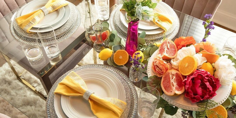
Color is a flexible design element that lets your space evolve throughout the year. Embrace seasonal palettes like rich jewel tones and gold during the holidays, or soft pastels and vibrant citrus shades in spring and summer. Textiles and table accessories offer the perfect opportunity for seasonal color exploration without major commitment. The abstract floral pattern of the Flower Placemat, rendered in sparkling glass stones, creates a versatile foundation for tablescapes throughout the year. Pair it with fresh pastels for spring gatherings or surround it with deeper tones for fall entertaining.
A quick refresh with throw pillows, florals, or table linens can completely transform the energy of a room without major renovation. Think about creating a core collection of neutral foundation pieces, then investing in seasonal accents that can be rotated throughout the year. This approach creates spaces that feel consistently fresh and aligned with the world outside your windows.
Creating Color Harmony Across Open Spaces
Today's open-concept homes present unique color challenges. How do you create distinct areas while maintaining overall unity? The secret lies in creating a unified color language that allows for variations within a harmonious framework. Start by establishing a neutral foundation that flows throughout connecting spaces, then layer in color zones that define different functional areas.
Think about the concept of color threading. Repeat accent colors in subtle ways across different spaces to create unconscious connection. A navy blue that appears prominently in your living room might reappear as a small accent in adjoining spaces. This creates visual flow without obvious repetition. This technique creates spaces that feel thoughtfully designed rather than rigidly matched.
Transitional spaces like hallways and staircases present perfect opportunities for color progression. These subtle shifts guide the eye and create natural movement between different color zones. Rather than abrupt changes, these gradual transformations create a sense of intentional journey through your home's color story. Glam picture frames positioned along these pathways can serve as connecting elements that tie different color zones together.
READY TO HARNESS COLOR'S POWER?
Building Color Confidence:
- Create digital mood boards collecting images with colors that resonate
- Observe how different colors affect your energy and mood throughout day
- Start with smaller spaces like powder rooms to experiment with bold choices
- Use accessories and textiles to test colors before larger applications
Strategic Application:
- Warm tones for social spaces to invite conversation
- Cool palettes for focus and productivity in work areas
- Seasonal color rotation through accessories and textiles
- Color threading for flow across open-concept spaces
From setting the mood to reflecting your style, color is the most powerful tool in your home decor toolbox. Whether you're layering textures in a glam living room, styling a vibrant tablescape, or refreshing your bedroom with calming tones, thoughtful color choices invite emotion and elevate your everyday. Don't be afraid to experiment, mix hues, and let your personality shine—one shade at a time.
Comments
Leave a Comment