The Art of Pattern Mixing: Creating Layered Spaces

Mixing patterns in home decor can seem daunting, but when done thoughtfully, it brings elegance and personality to any space. The key is balance—curated, not chaotic. Here are a few dos and don'ts to help you layer with confidence.
Thoughtful pattern mixing adds personality, depth, and energy to any space. The secret lies in creating intentional combinations that feel cohesive rather than chaotic—letting each pattern enhance the others while maintaining visual harmony.
DO: Start with a Neutral Base
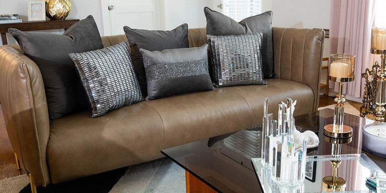
Begin with a calm foundation. Neutral walls, simple bedding, or a soft-toned sofa create visual breathing room. If your wallpaper is bold, opt for solid furniture. If your upholstery has pattern, keep the walls minimal. This approach lets your patterns pop without competing. For soft texture and layering ease, explore our glam throw pillows to build your base.
When establishing your neutral foundation, consider the undertones in your space. Warm neutrals like cream, taupe, and camel create a cozy atmosphere that pairs beautifully with gold accents and rich patterns. Cool neutrals such as gray, silver, and white offer a crisp backdrop that highlights vibrant colors and high-contrast patterns.
Remember that texture can add dimension to your neutral base without competing with patterns. A plush velvet sofa in a solid color provides both tactile interest and visual simplicity. Similarly, a textured wall treatment in a neutral shade creates depth while maintaining the room's calm foundation.
DON'T: Overdo the Mix
It's easy to get carried away, but restraint is your friend. Stick to two or three patterns in a space. Think in layers: a primary pattern, a secondary one, and a subtle accent. This creates harmony and keeps the space from feeling cluttered.
DO: PATTERN MIXING RULES
- Use the 60-30-10 rule (60% dominant, 30% secondary, 10% accent)
- Create visual hierarchy that guides the eye naturally
- Use bold, large-scale patterns sparingly for impact
- Incorporate subtle patterns more generously
DON'T: COMMON MISTAKES
- Mix more than three patterns in one space
- Give equal visual weight to all patterns
- Combine patterns without a unifying element
- Scatter patterns randomly without intention
When selecting your patterns, think about their personality and energy level. Bold, large-scale patterns make powerful statements and should be used sparingly. More subtle patterns with less contrast can be incorporated more generously without overwhelming the space.
DO: Vary the Scale
Mixing different pattern sizes keeps things dynamic. Pair a large floral with a medium geometric and a small print. Scale contrast helps each pattern stand out without overwhelming the space.
When varying scale, aim for clear differentiation between your patterns. If your primary pattern features large motifs (like oversize damask or bold stripes), your secondary pattern should be noticeably smaller (perhaps a medium-scale geometric), while your accent pattern might be quite fine (like a small dot or subtle texture). This distinct size hierarchy prevents patterns from competing with each other.
PATTERN SCALE GUIDELINES:
- Consider viewing distance when selecting pattern scale for your space
- Larger rooms can accommodate bigger, bolder patterns appreciated from across the space
- In smaller rooms, incorporate more moderate scales that don't overwhelm limited square footage
- The Fifth Avenue Pillow offers perfect secondary pattern with glass stone design
DON'T: Stick to One Texture
Pattern mixing isn't only visual—it's tactile too. Play with texture by layering velvet, rhinestones, faux fur, or metallics. A rhinestone pillow next to a soft velvet cushion? Instant glam. Just keep the color palette consistent so everything flows.
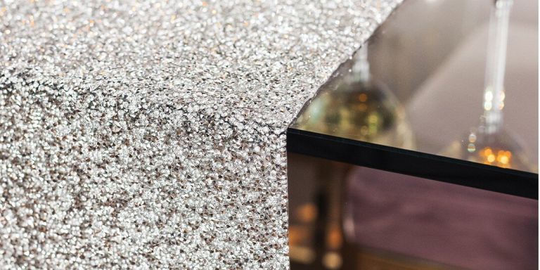
Texture adds a crucial dimension to pattern play that engages multiple senses. While patterns please the eye, textural variation invites touch and creates depth through how surfaces interact with light. Smooth, reflective fabrics like satin or metallic-threaded materials catch and bounce light, while matte textures like linen or cotton absorb it, creating natural contrast.
INSIDER TIP: TEXTURAL STATEMENT PIECES
Consider incorporating the Luminous Allover Pillow as a textural statement. Its thousands of tiny rhinestones create a dazzling surface that contrasts beautifully with softer textures while maintaining a cohesive color story. This interplay between smooth glass rhinestones and plush velvet or soft cotton creates the kind of dimensional interest that elevates pattern mixing from good to spectacular.
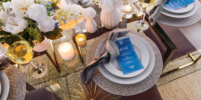
DO: Use a Unified Color Palette
To tie everything together, choose two or three core colors and echo them throughout your patterns. Whether you go bold (hot pink and silver) or rich (navy and gold), color is your through-line. And yes, sparkle counts as a color.
A consistent color story serves as the invisible thread connecting diverse patterns. For maximum impact with minimal risk, select patterns that share at least one common hue. This connection creates cohesion even between dramatically different designs, allowing you to combine traditional motifs with contemporary ones or organic shapes with geometric elements.
COLOR PALETTE STRATEGIES:
- Consider how color saturation and temperature affect your pattern mix
- Jewel tones create rich, luxurious combinations while pastels offer softer layering
- Mixing patterns within the same color temperature family creates more harmonious results
- Incorporate metallic elements throughout—the Monte Carlo Pillow features sophisticated glass rhinestones that catch light brilliantly
DO: Create Balance Through Distribution
Strategic placement of patterns throughout your space creates visual balance that feels intentional rather than chaotic. Distribute your patterns evenly around the room rather than concentrating them in one area. If you have a boldly patterned accent chair on one side of the room, balance it with patterned pillows or artwork on the opposite side.
Consider the visual weight of different patterns when placing them. Bold, high-contrast patterns carry more visual weight than subtle, low-contrast ones. Balance a dominant pattern on a large piece (like a patterned area rug) with smaller accents in complementary patterns distributed throughout the space.
PATTERN DISTRIBUTION ESSENTIALS:
- Allow solid-colored elements and empty spaces between your patterns to give the eye places to rest
- This breathing room highlights your thoughtfully chosen patterns rather than diminishing their impact
- Balance dominant patterns on large pieces with smaller complementary accents throughout the space
- Consider adding the Boss Babe Pillow as a statement piece with personality
Thoughtful pattern mixing adds personality, depth, and energy to any space. Start neutral, mix scales and textures, and stick to a palette that feels cohesive. Add a few glam accents from Sparkles Home—like the Boss Babe Pillow—and you're golden. Ready to layer like a designer? Let your patterns shine.
Comments
Leave a Comment